
Posterise tool is quite frequently found in photo editing applications and is very rarely used. In my opinion it is a tool that has been carried over without much thought in the present day photo-editors. However it does come of use at times.

(A photograph of fishermen which was posterized using Affinity Photo and later used as a background for a poster with a motivational one liner added in the grey area on the right)
What is Posterization?
This is a method of reducing the tonal range in an image. In simple words if an image has say 128 shades of a color, posterizing the image means reducing this range of colors. The above image was a black and white photograph which was reduced to just 4 shades/tints of grey. Posterization coverts subtle gradations of colors to flat areas of colors without any gradations. The larger gradations in the original photograph appear as sudden change in color shade.
Similar results to an extent can also be had by saving the image as jpg with a limited bit depth but using posterize tool makes it possible to visualize the image and tweak it with proper control. Interestingly, the banding seen in low end monitors in areas of fine gradations is also due to posterization of the display caused by a monitor’s inability to display the fine gradations.
As the history has it, this process was initially used to print posters with their limited number of shades. Try looking over old posters from US and USSR during the cold war era. Those bright stars and stripes from US or the deep red background of the USSR posters were due to the posterization.
Why use Posterize?
In practicality the posterize is making the resulting image loose some information. Depending on the amount of tonal values permitted this loss can be quite substantial. So, why use this tool at all?
Posterization can be applied for various purposes. Some of the common ones are –
- Reducing a photograph to a line art or a poster with limited shades. Artistic applications are limitless and an artist’s imagination is the only limiting factor.
- Removing noise or artefacts from an already existing line art or sketch.
- Vectorizing a photograph for whatever reason.
- And the most important for photographers – posterizing only a part of the image, usually background to achieve flat tones. I have tried using it for product photography as a way to achieve a simple colored background or to remove imperfections from logos seen in the photographs. I found it difficult but maybe with patience and experience, I might get good at this.
Posterize Tool
Posterize tool can vary from a simple tool to a fairly complicated one. Gimp provides it as a simple tool with a sliding control to vary the depth of gradations from 2 to 256, 2 being just two extremes of shades. Affinity photo has a fairly complicated tool. (To launch it in Affinity Photo, go to the layers tab on the right and click on the adjustments icon on the lower side of the panel)

The Posterize tool in Affinity Photo has the usual slider which ranges from 1 to 128, where 1 represents the equivalent of 2 in Gimp. Apart from the slider, one of the most important settings available here is the Blend Mode. This gives a long list of options which change the way how posterization affects the image. The normal mode is what straight forward posterization does. There are modes that increase the effects of posterization on the darker side of the histogram or on specific colors. Some other modes even go close to inverting colors. The best part is that all these modes work in live preview mode and even scrolling through these modes, shows the effect on the opened photograph.
Next to the Blend Mode is a small settings wheel. Clicking on this opens up another window, titled Blend Options.

The Blend Options window can be further used to tweak the posterization results. The two graphs seen are the level of posterization across various tonal ranges. How I understand it is that the left hand of the graph works on the dark tonal values, the middle portion on the mid-range tonal values and the extreme right on the lighter tints. I too am still trying to understand this. Once again all these controls also show their effects in real time on the image. So play around with them and learn to use them well. I use these Blend Options to work on one specific range of tonal values, like the background in product photographs. By keeping the graph low for the area that I do not want to posterize, I am able to retain all the subtle gradations in that color and posterize the areas that I want to. Adding the effect to a small area (using a mask) and then combining it with the option to work on red, blue or green channel, really enhances the power of Posterize.
Tips on using Posterize
- Use it as little as you can. It does reduce the image quality after all, by reducing the range of tonal values.
- Use it as a mask and apply only to the areas where you need the effect.
- Always save the final image as a copy and not on top of the original.
- If you are using Photoshop, try experimenting with the ‘cut-out’ filter in combination with Posterize.
- For posterizing, choose simple and minimalistic photographs. They give more pleasing results.
- Initially, it is nice to play around with the tool and see the various effects. However once you get used to it, always have an aim in mind before starting and move in the direction to get that desired result from posterize tool.
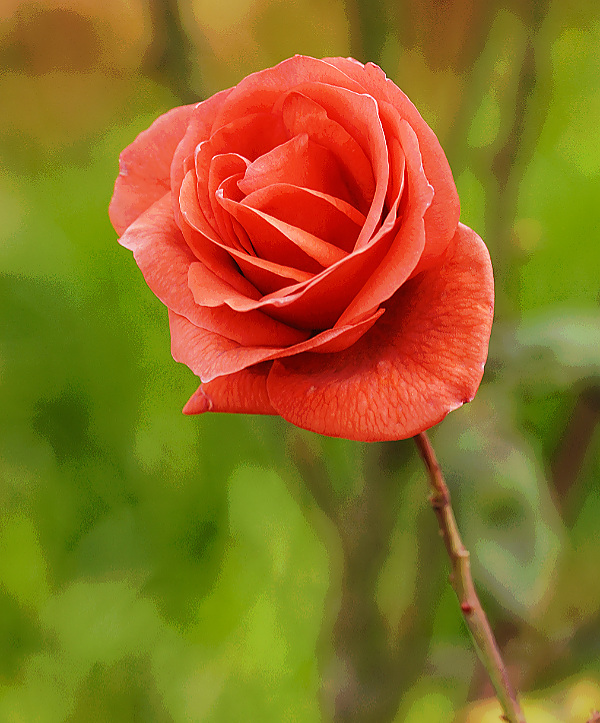
(A simple photograph of rose which was posterized to have an interesting background but without affecting the rose much. Achieved in Affinity Photo, using the Posterize tool with Blend Mode set to Overlay and with the Blend Option as shown in the image above.)
I am still learning to use the posterize effect. There are many more things that maybe possible. This article is based on what I have learnt till now.

Pingback: How to posterize image with Procreate - PhotoLens